After a long, cold winter trapped indoors, many of us find ourselves desperate to make a change… and even the simplest alteration to our surroundings can create a seemingly complete transformation. Our favorite way to freshen a space? Hands down, it’s by changing out paint colors. We asked three of the Senior Designers on staff at Interiors Joan and Associates what their favorite paint color is to use in projects and why.
BETH SETTLES,
ALLIED MEMBER ASID
“I love to use A Stone’s Throw by PPG. The color is deep and rich looking. It’s
a gray – brown chameleon color that goes well with golds, creams, and also gray tones.”
ELLEN TURNAGE,
ALLIED MEMBER ASID
“Revere Pewter by Benjamin Moore. This color provides a serene canvas that renders precision and definition to my projects.”
JENNY COLSON,
ALLIED MEMBER ASID
“SW 7069, Iron Ore by Sherwin Williams. I love to use this color for a strong accent in a room whether it be on walls or cabinets.”
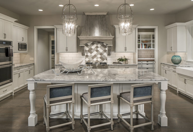
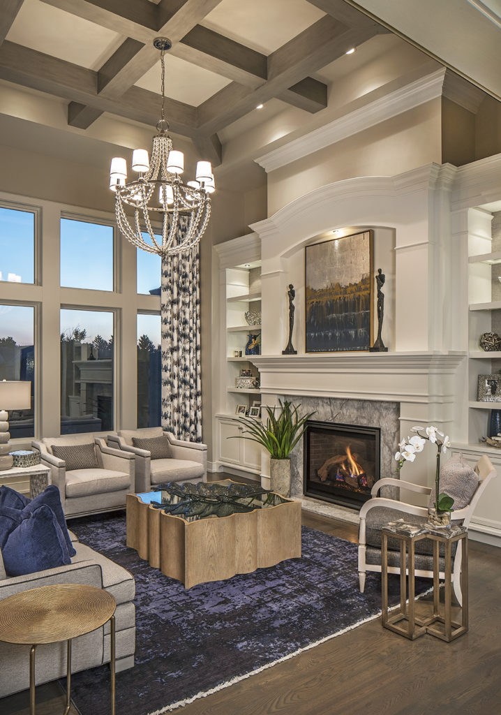
Paint is an easy enough switch that you can afford to change with the trends. Soft, soothing neutrals are always well received and serve as complimentary backdrops to furnishings and accessories. Warm, earthy colors lend a cozy feel to a space, while cooler colors tend to give the impression of a larger space or a serene ambiance.
Color can take on a completely different hue depending on the amount and type of light that penetrates the room. Tones and shades of colors can morph into variants of gray, pink, and green if the light is “just right.” An experienced designer can take all things into consideration when selecting the right hue for your space. This one simple choice can make a world of difference in the success or failure of your overall design schematic.


